Back to blog home
New Look, Same Rhombus! Meet Our Rebranded Name, Logo, & Website
by Team Rhombus, on August 2nd, 2022
Growth and Company CultureThe time has finally come.
Rhombus Systems is rebranding; we are now officially ‘Rhombus’!
This rebrand has three parts to it:
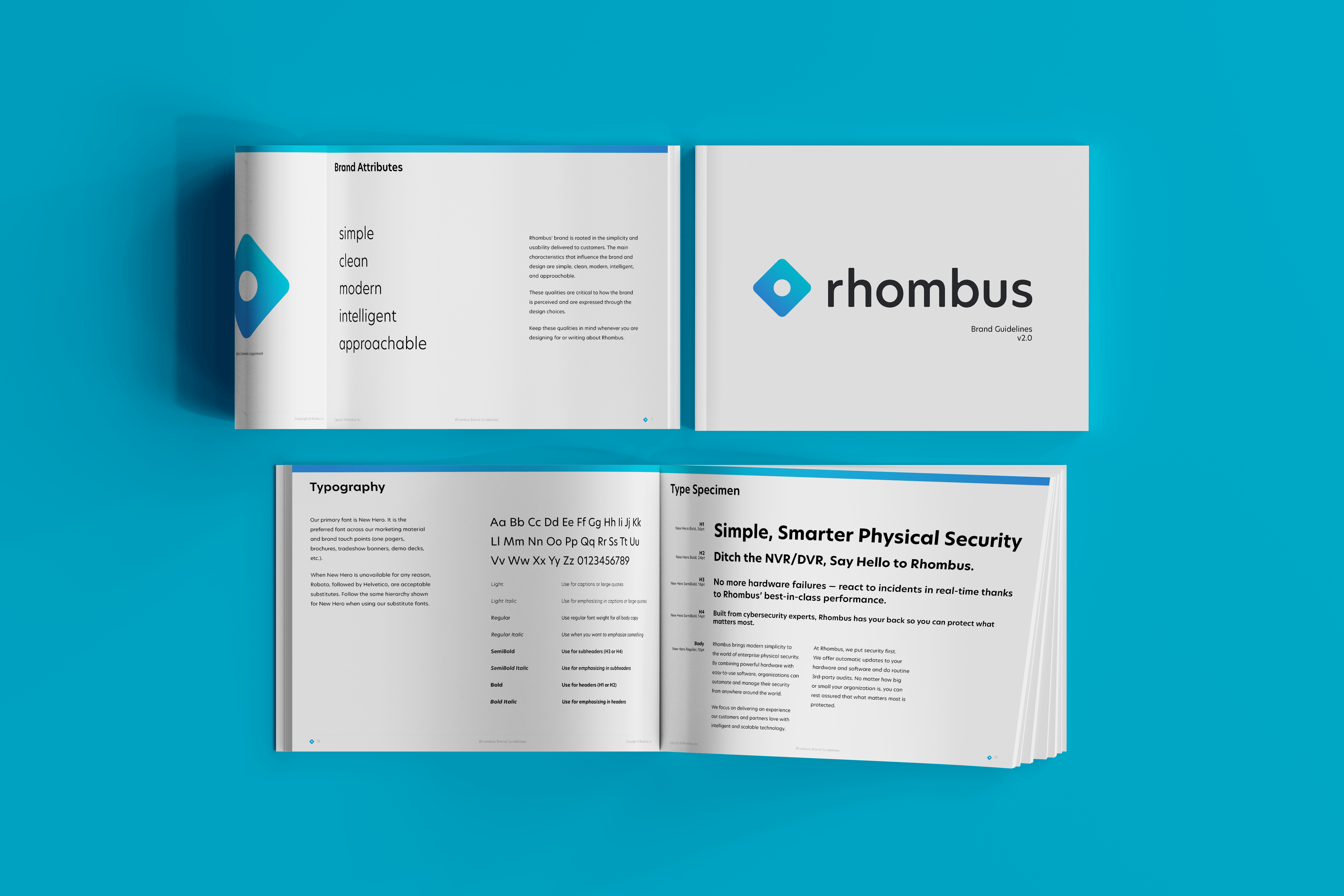
- New logo: Modern design featuring the Alpha Camera Logomark.
- New name: Rhombus. No more ‘systems’.
- New website: Our new home is www.rhombus.com. Not only has our domain name changed, but we’ve launched a refreshed site built from the ground up. It’s snappier, more intuitive, and aligned with our brand identity.
This change has been in the works for a long time. Here’s why we decided we were ready to evolve the Rhombus brand and an introduction to the new look.
Why Rhombus Is Saying Goodbye to ‘Systems’
First created back in 2016, the original Rhombus Systems logo served us well for many years.
However, as we grew, minor inconveniences began piling up:
- The double ‘s’ in Rhombus Systems made our name clunky to say out loud.
- In emails, typing @rhombussystems.com is incredibly prone to typos and transposed letters.
- Our original logo had poor readability in small forms and on our devices. Every part of it—the thin lines of the rhombus shape, the ‘r’, the period—quickly became illegible at any distance.
![]()
The original Rhombus logo, and the logo on a camera.
A Matter of Identity
There were practical reasons to rebrand, but what was the tipping point?
Like all rebrands, it was ultimately a matter of identity.
We realized that no one, not even our internal team, thought of us as ‘Rhombus Systems’. To our partners and customers, we’ve been ‘Rhombus’ for a long time. Change was brewing; it was just a matter of timing.
New Name and Logo, Same Rhombus
In early 2022, the perfect catalyst struck: we acquired the Rhombus domain. We’d been considering a rebrand for over a year, and the timing was finally right.
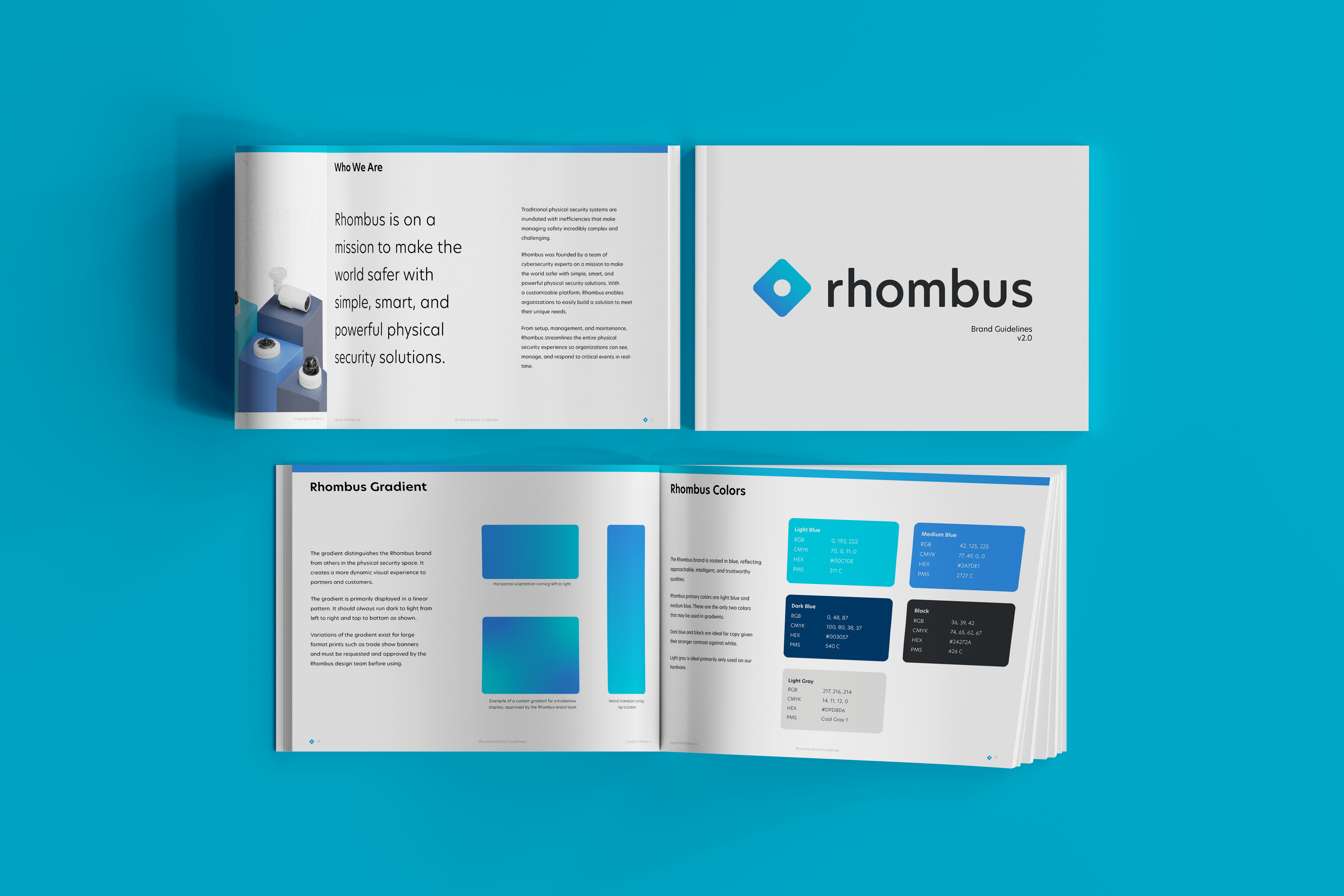
The Modernized Logo
The new Rhombus logo features what we’ve dubbed the Alpha Camera Logomark.
Rhombus’ iconic mark is a callback to the Alpha camera produced back in 2016. It is comprised of a simple rhombus shape with rounded corners and a circular negative space in the middle to symbolize the camera lens.
The iconic mark is designed to be legible in all sizes, big and small. It’s also accurate in multiple orientations.
![]()
The Alpha Camera Logomark
The Simplified Name
We have officially dropped ‘Systems’ from our name.
As we mentioned, virtually all of our internal employees, partners, and customers already refer to us as ‘Rhombus’. Across dozens of case studies, hundreds of testimonials, and thousands of Slack messages, ‘Rhombus Systems’ can hardly be found.
We’ve been Rhombus for a long time. Now, it’s just official.
![]()
The new brand embodies what Rhombus does best: simplified, modern security. It is a callback to our alpha camera that Dave, our VP of Hardware, 3D printed in his garage back in 2016 when the company was founded. It stands as a reminder that no matter where we go, we will always be reminded of our humble beginnings.
The concept of our rebrand is rooted in these values:
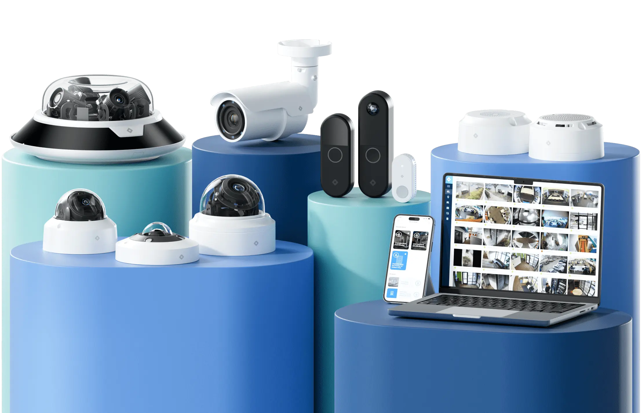
- Simplicity: Our new name is a simplified version of the original, and the new logomark is a single, fluid shape. Simplicity and ease of use are at the core of the Rhombus experience. From the beginning, our founders were on a mission to make the world safer with a powerful enterprise platform that was intuitive enough for anyone to use.
- Integrity: Shades of blue are traditionally associated with trust, calmness, and intelligence. The Alpha Camera Logomark is a reference to our humble beginnings. We believe honest communication is key to success, and we conduct business the way it should be—with high ethical standards and to always do what’s right.
- Friendliness: The warmer blue hues emphasize our friendly approach to our business and the partnerships we develop with all our end users and authorized resellers. The rounded corners of the rhombus and font also symbolize this approachability. Relationships are at the heart of what we do, and we always put our customers and partners first.
- Innovation: The gradient creates a more dynamic visual experience and distinguishes the Rhombus brand from others in the physical security space. We are committed to thinking bigger, challenging the status quo, and creating better, more innovative ways to serve our partners and customers.
Into the Future as Rhombus
Going through a rebrand is no small feat. It requires dedication from our entire organization and an immense commitment to delivering the best possible experience to our community. At Rhombus, we believe in going above and beyond and striving for constant improvement. So, while we have a new logo and brand, our work in defining who we are is never entirely done.
As we continue to increase the incredibly high standards we place on ourselves, we hope that in turn, Rhombus becomes your standard in physical security.
%20--%3e%3csvg%20version='1.1'%20id='Layer_1'%20xmlns='http://www.w3.org/2000/svg'%20xmlns:xlink='http://www.w3.org/1999/xlink'%20x='0px'%20y='0px'%20viewBox='0%200%20110%20110'%20style='enable-background:new%200%200%20110%20110;'%20xml:space='preserve'%3e%3cstyle%20type='text/css'%3e%20.st0{fill:url(%23SVGID_1_);}%20%3c/style%3e%3cg%3e%3clinearGradient%20id='SVGID_1_'%20gradientUnits='userSpaceOnUse'%20x1='25.325'%20y1='766.725'%20x2='84.725'%20y2='707.325'%20gradientTransform='matrix(1%200%200%201%200%20-682)'%3e%3cstop%20offset='0'%20style='stop-color:%23006F94'/%3e%3cstop%20offset='1'%20style='stop-color:%2300C1DE'/%3e%3c/linearGradient%3e%3cpath%20class='st0'%20d='M106.9,47.5L62.5,3.1c-4.1-4.1-10.9-4.1-15,0L3.1,47.5c-4.1,4.1-4.1,10.9,0,15l44.4,44.4%20c4.2,4.2,10.9,4.2,15.1,0L107,62.5C111,58.4,111,51.6,106.9,47.5z%20M55.5,71.2c-9.4,0.3-17-7.3-16.7-16.7C39.1,46,46,39.1,54.5,38.8%20c9.3-0.3,17,7.3,16.7,16.7C70.9,64,64,70.9,55.5,71.2z'/%3e%3c/g%3e%3c/svg%3e)
Related Articles